Public Profile
Doctoranytime - B2B Health, Wellness & Fitness company
Role: Product Designer
Time frame: 2 month
My Team: Natali Marsrujeh (Product Manager), Thanasis Angelogeorge (Tech Leader), Dimitris Chatzis (Frontend developer), Vasilis Giaghgias (Backed Developer), Anna Foskolou (UX Writer).
Introduction
The challenge was that accurate doctor profiles are crucial for helping patients make informed decisions and improving search engine rankings. However, user feedback highlights issues with incomplete or unreliable doctor information, missing reviews, and availability inconsistencies. Currently, profile improvements rely heavily on the customer service team, with doctors—both paying and directory—rarely updating their own profiles. We believe doctors don’t fully recognize the value of maintaining high-quality profiles, limiting the overall effectiveness of the platform.
Goal
We aim to propose mechanisms to incentivize more complete and better quality doctor information and enhance the quality of patients decision making
Analysis
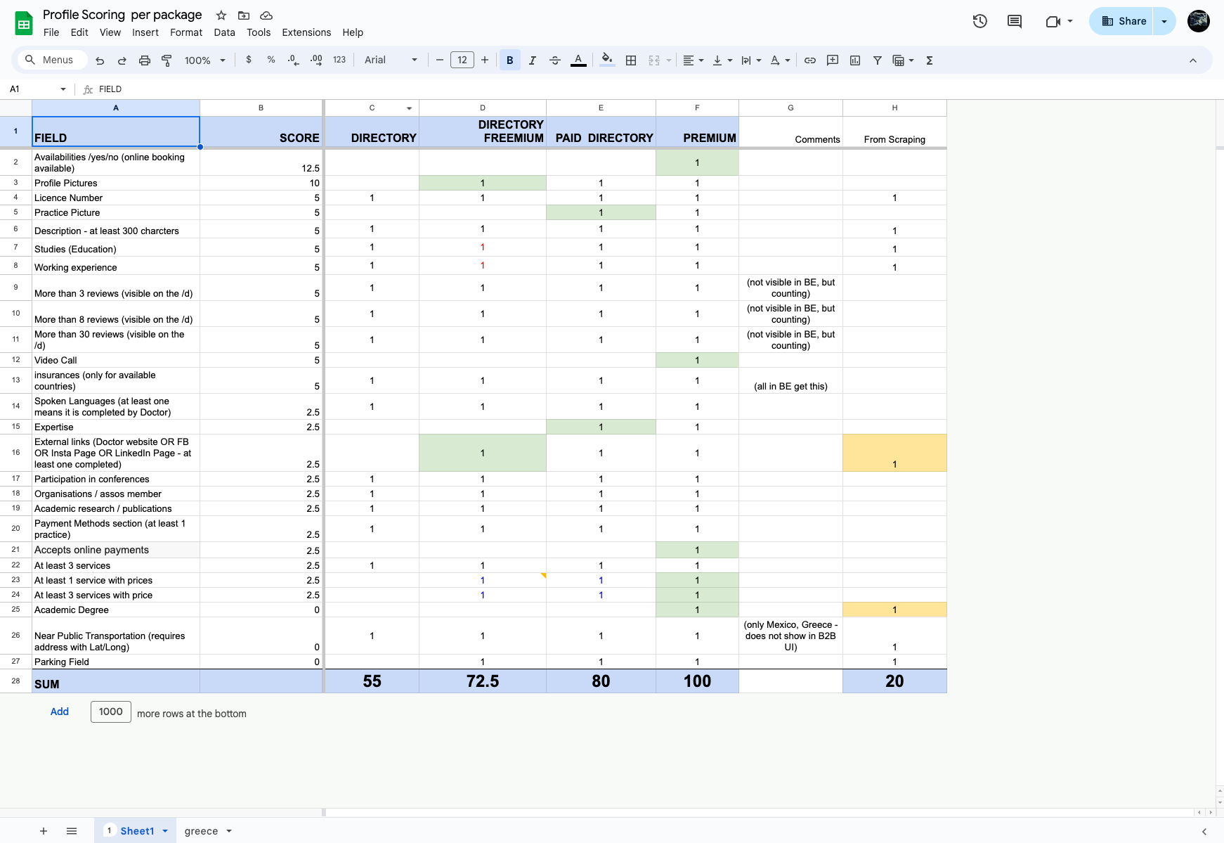
Profile scoring
We developed a profile scoring system to identify the essential information doctors should provide, focusing on what patients find most valuable. Using a 0-10 scale, we rated the importance of each piece of information to ensure profiles meet both doctor and
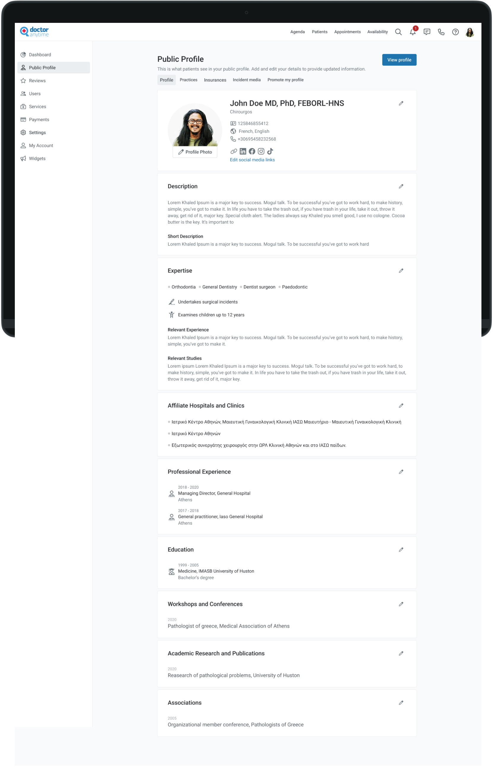
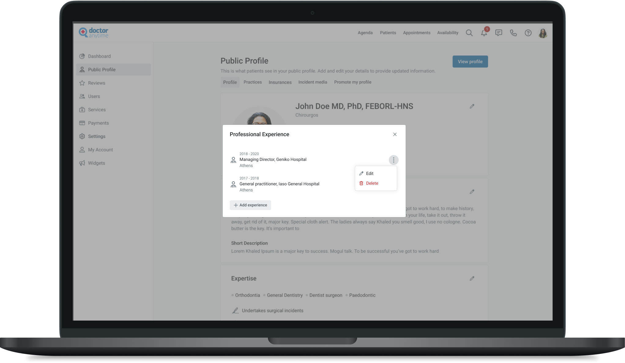
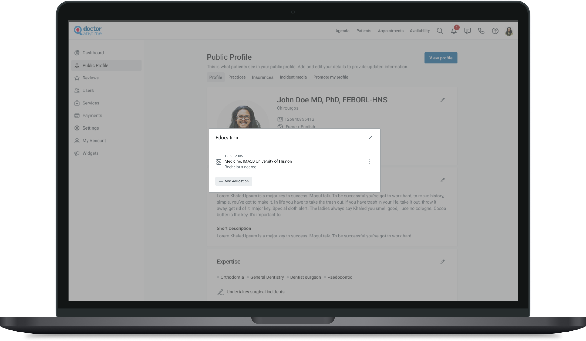
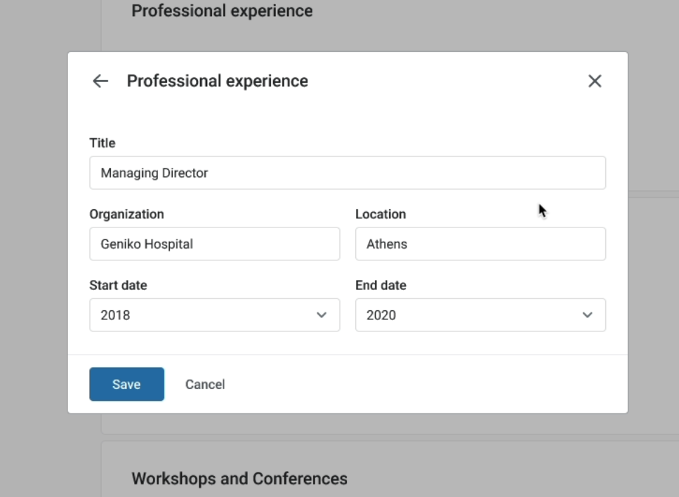
Redesign public profile
The most critical information for a high-profile score lies within the public profile section. However, when speaking with customer support, doctors revealed they were unclear on what needed to be completed and where. As a result, most profile updates are handled by customer support rather than the doctors themselves.
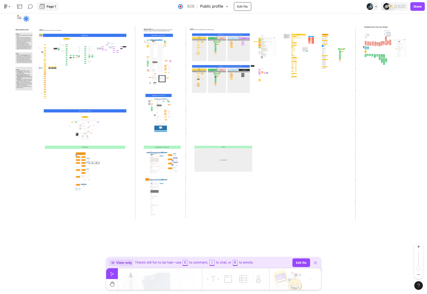
Main idea
- Analyze the current flows of the My Profile page
- Map out where information appears about the B2C profile of the doctors, taking into account their subscription package & country (insurances are only relevant for MX, BR & GR)
- Sorting of the different elements, according to the subject (for example currently, the information that appears on B2C under
- Access information is in two different tabs for the doctors to edit)
see more details here special thanks to Marialena Papadopoulou (Marilou)
Concept
Inspiration
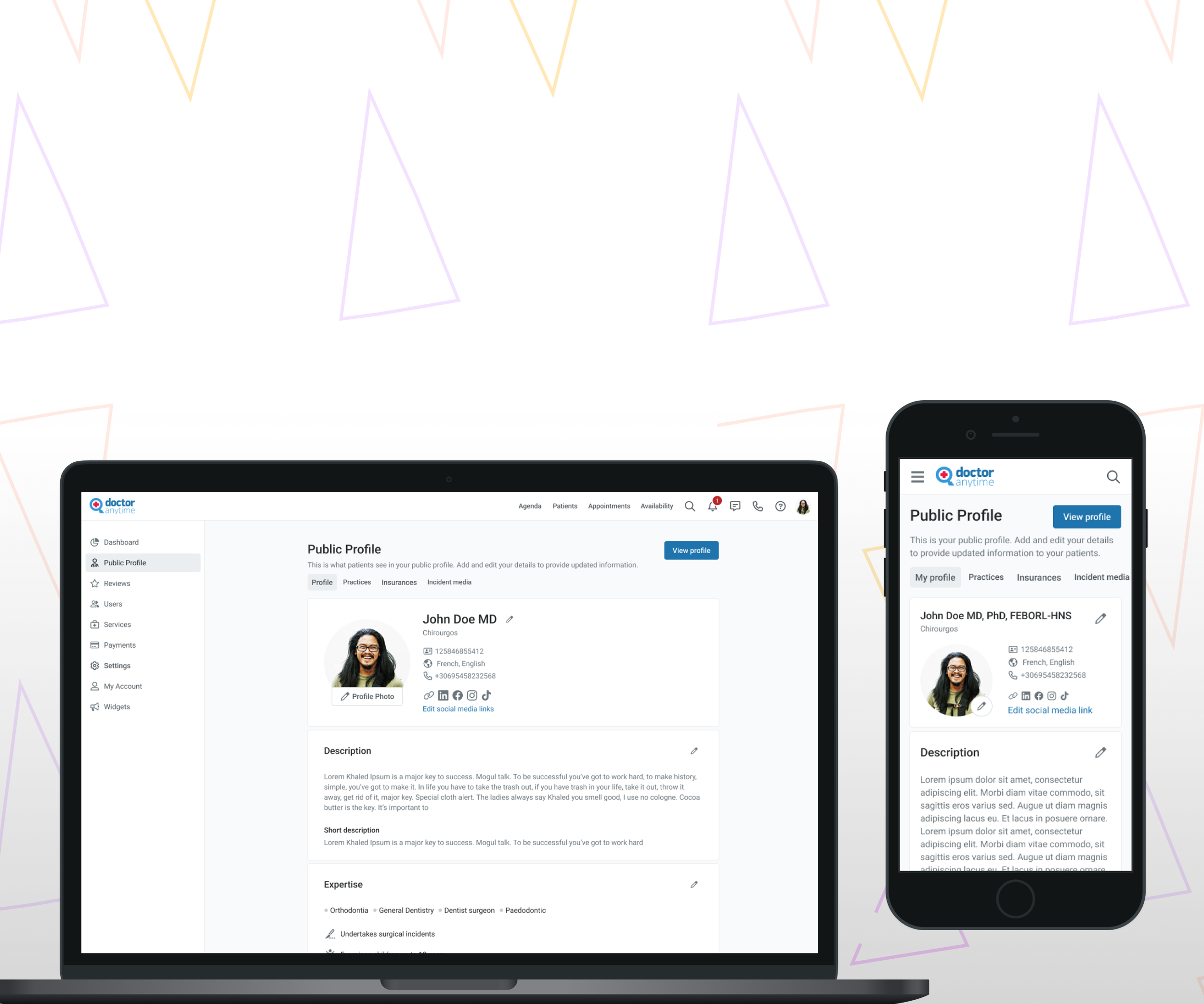
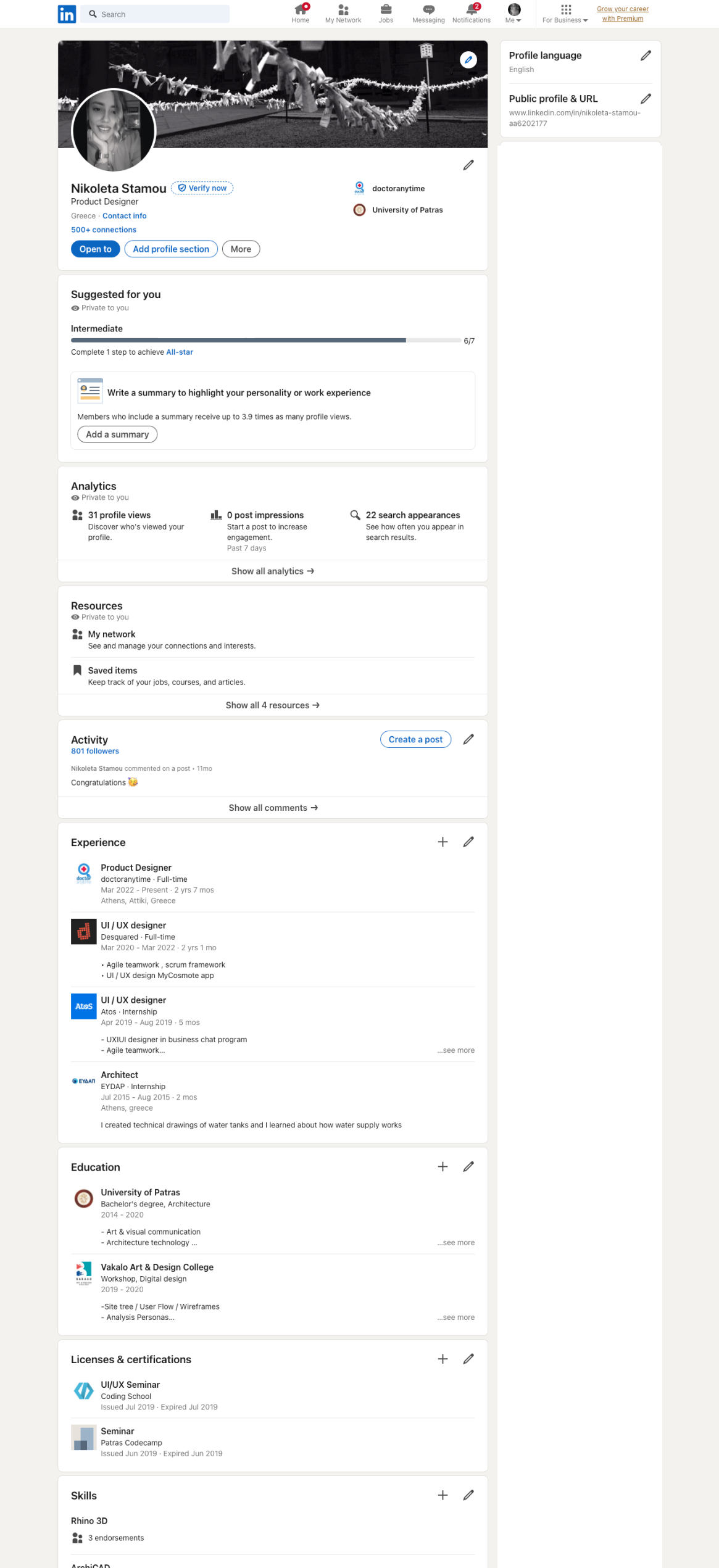
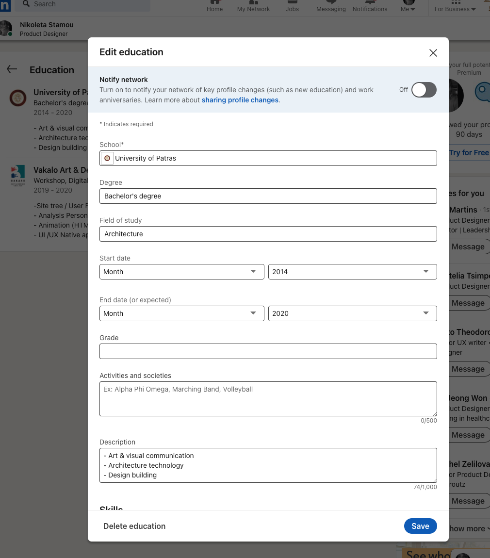
The inspiration for completing the information in the public profile was drawn from the structure of LinkedIn. We carefully analyzed its flow and user experience, then tailored and adapted those insights specifically to fit the unique needs and functionality of Doctoranytime.
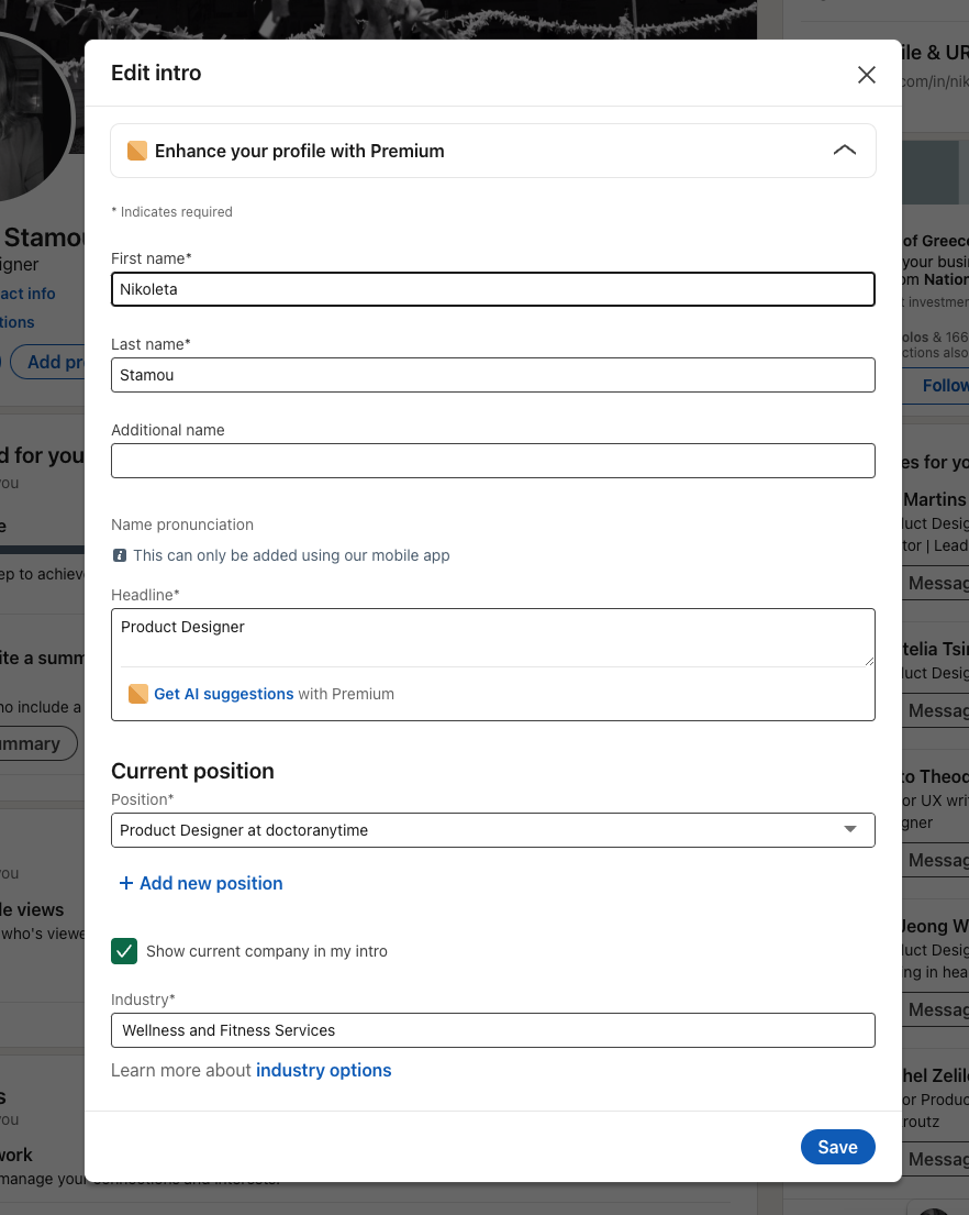
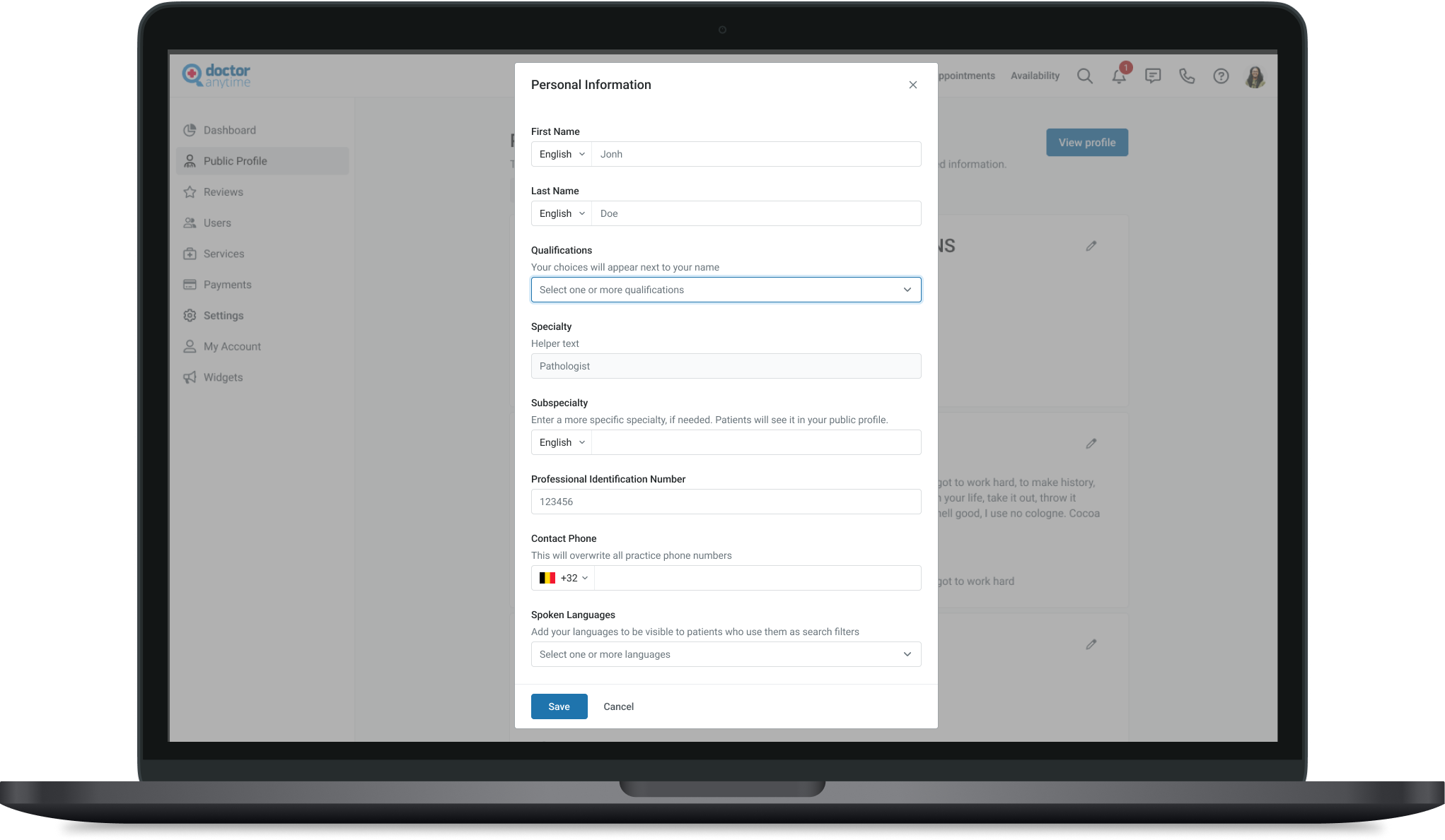
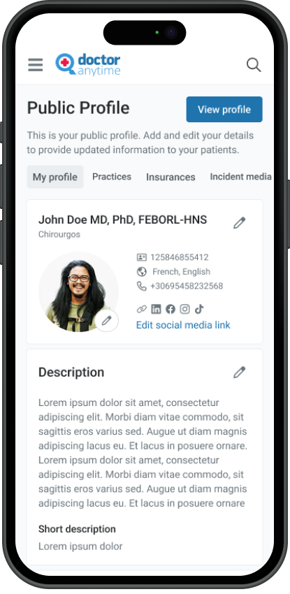
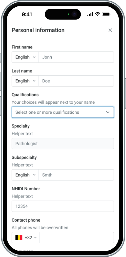
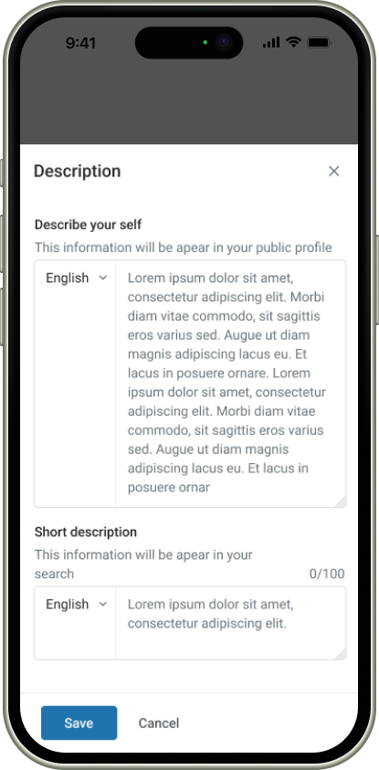
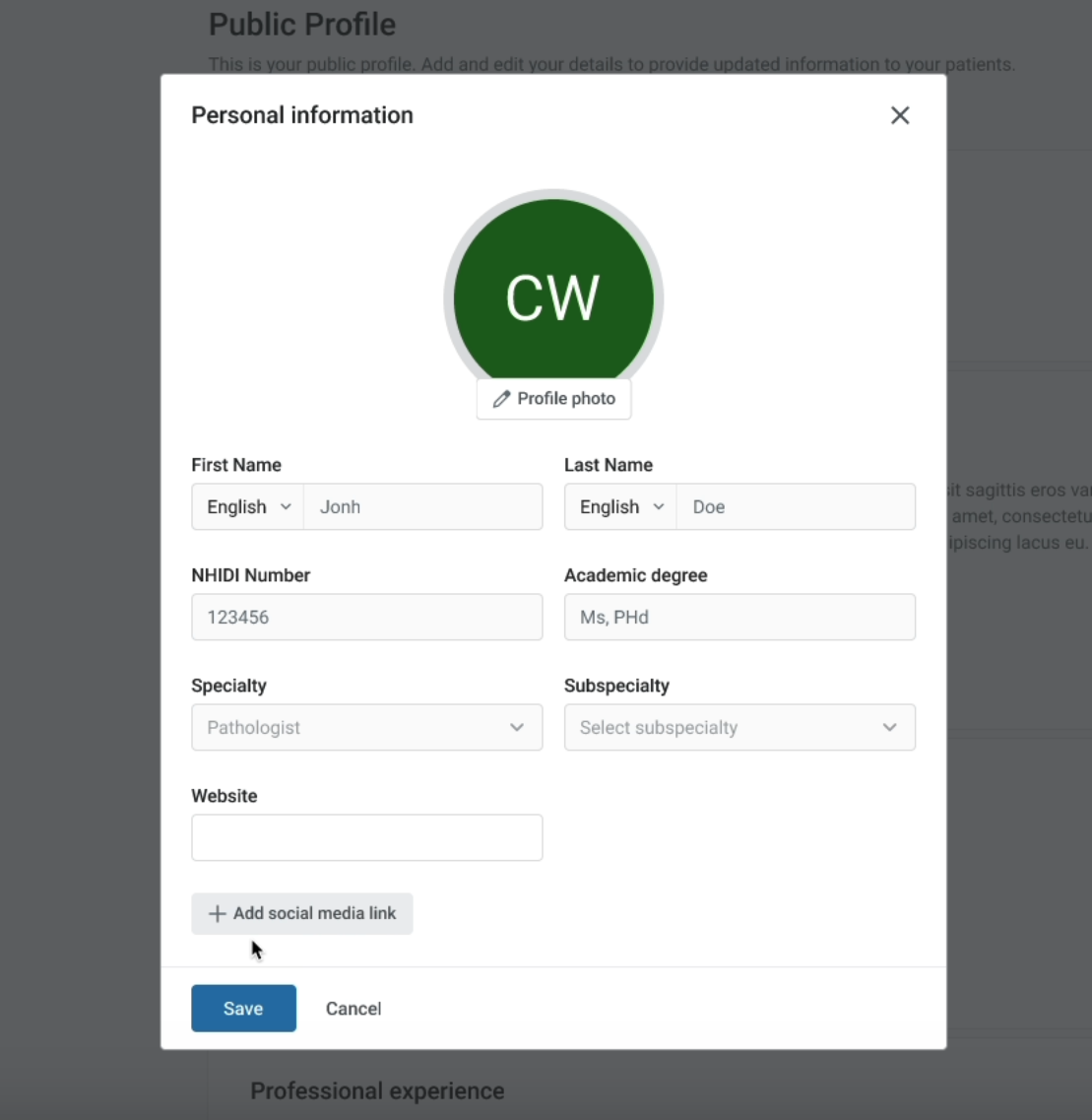
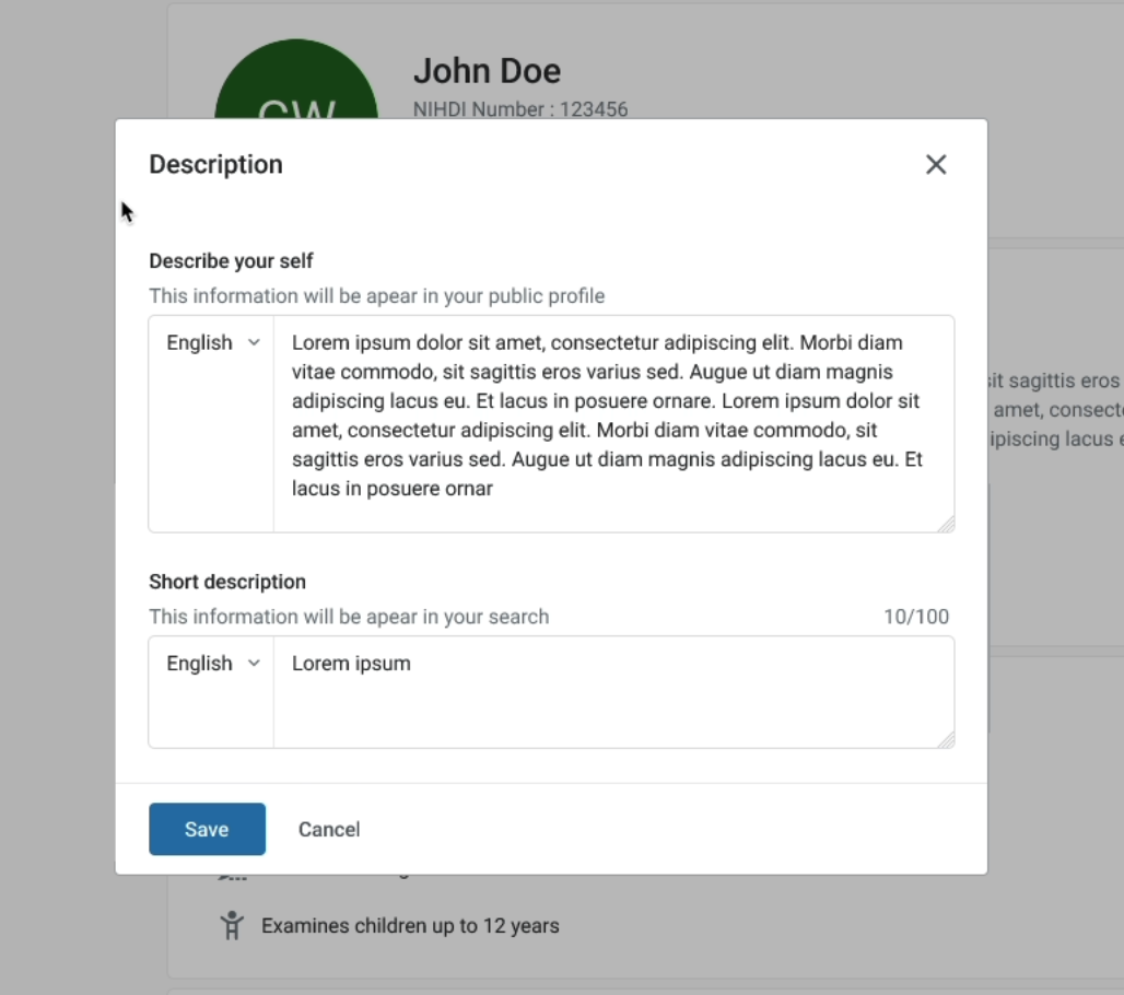
Personal information
the doctor will be able to modify his personal information such as name, surname, academic degree, specialty, subspecialty and to add social media links (instagram, tik tok, Linked in etc.)
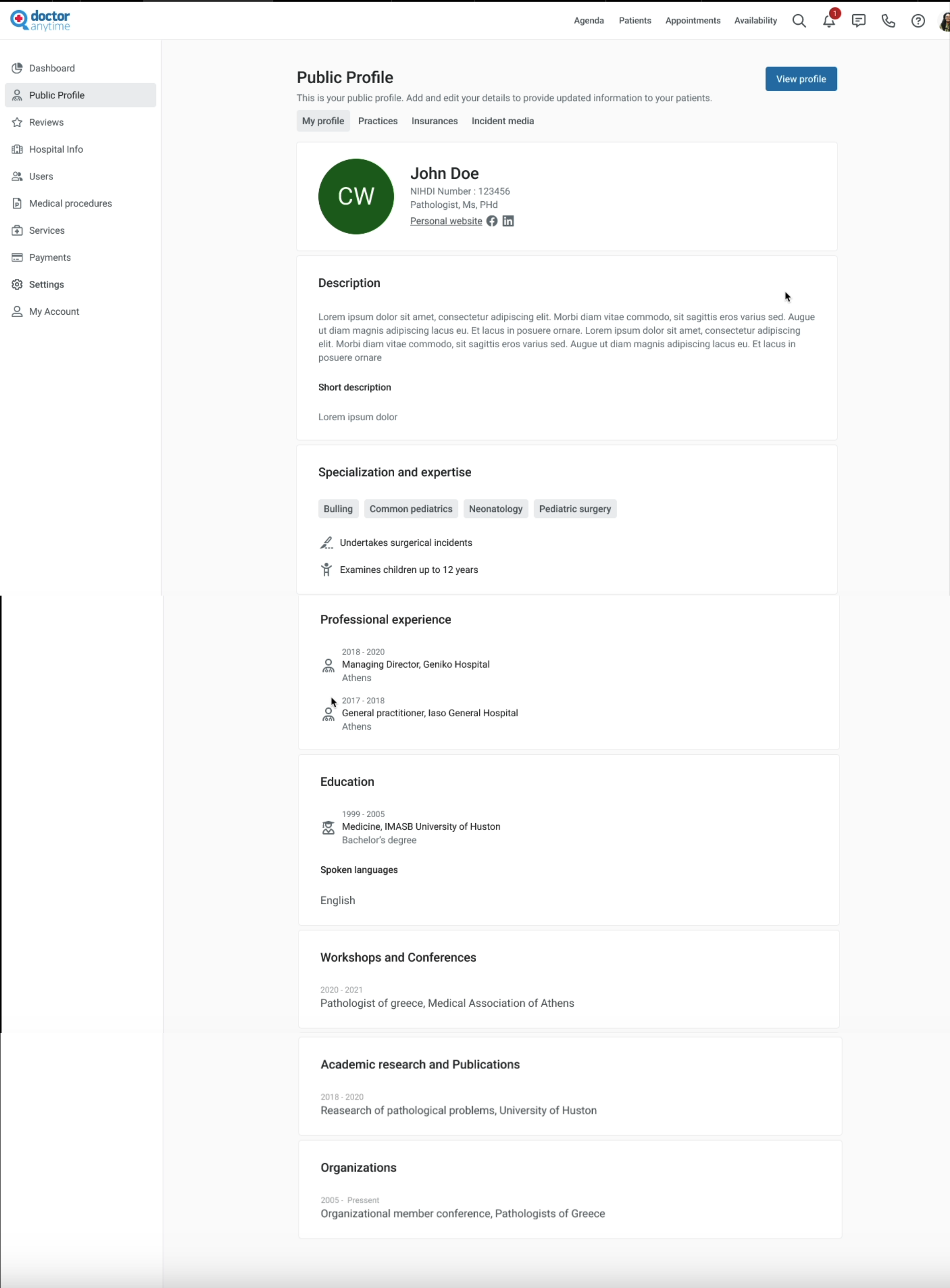
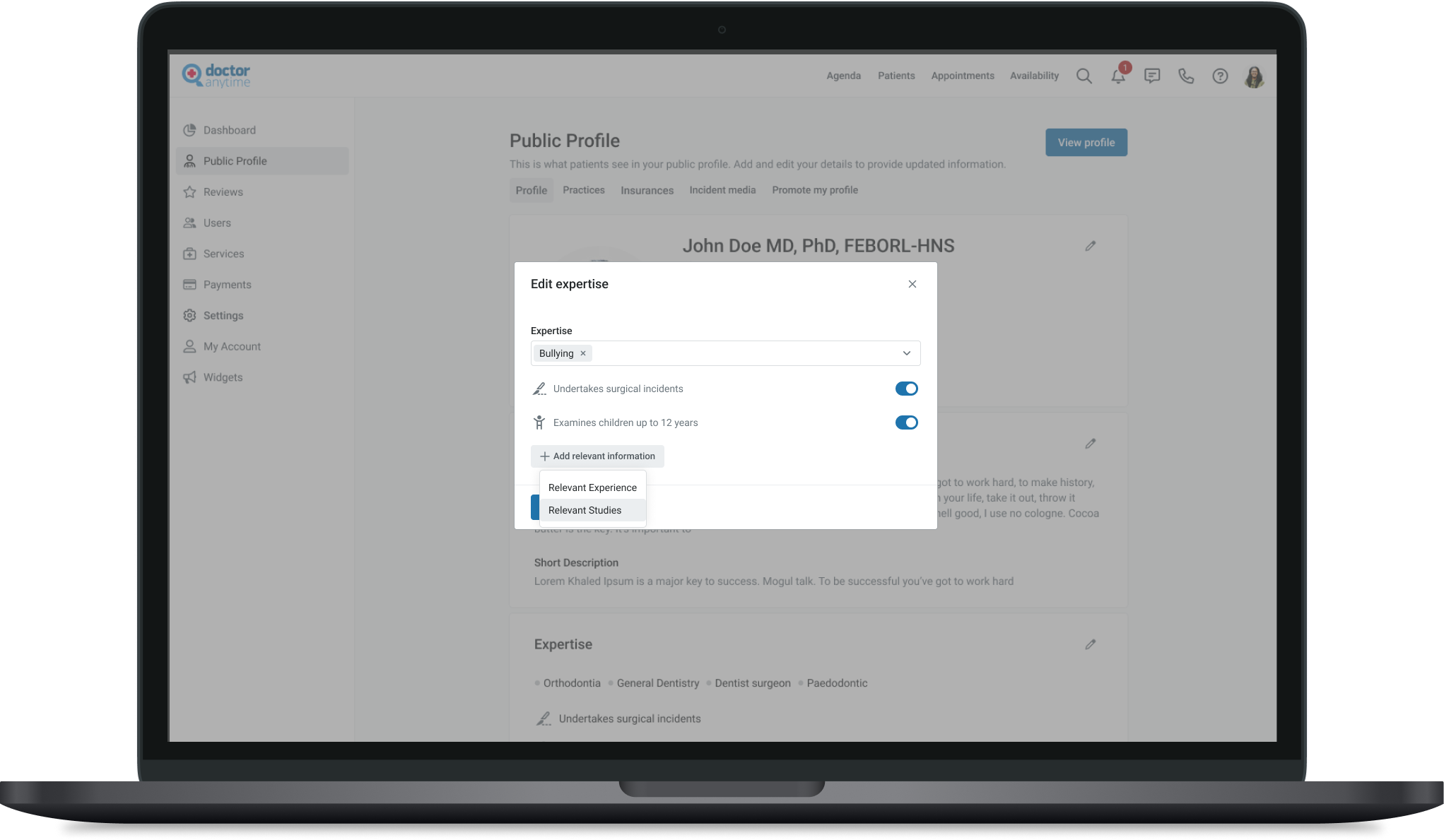
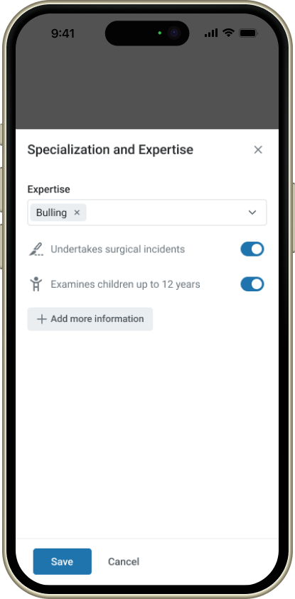
Specialization
the doctor will be able to add where exactly they specializes and specific information related to their specialty
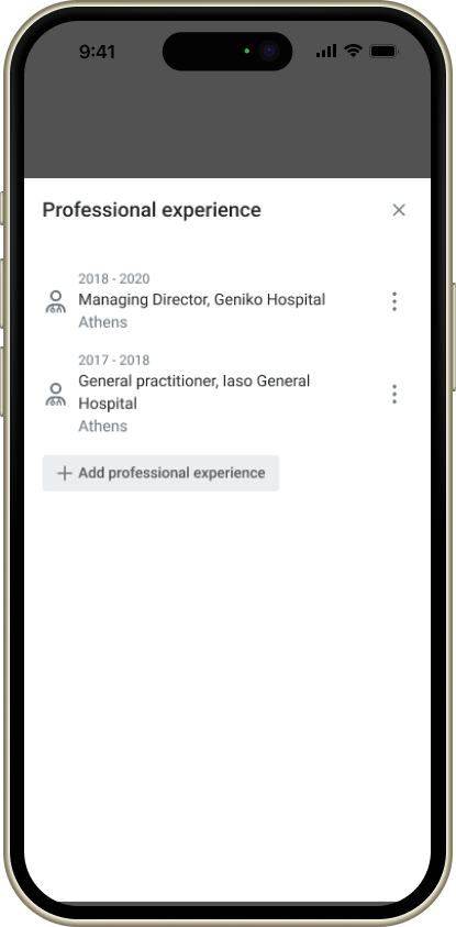
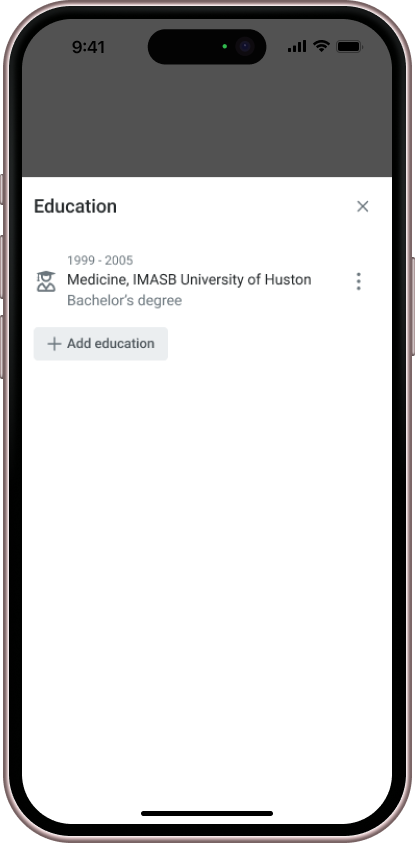
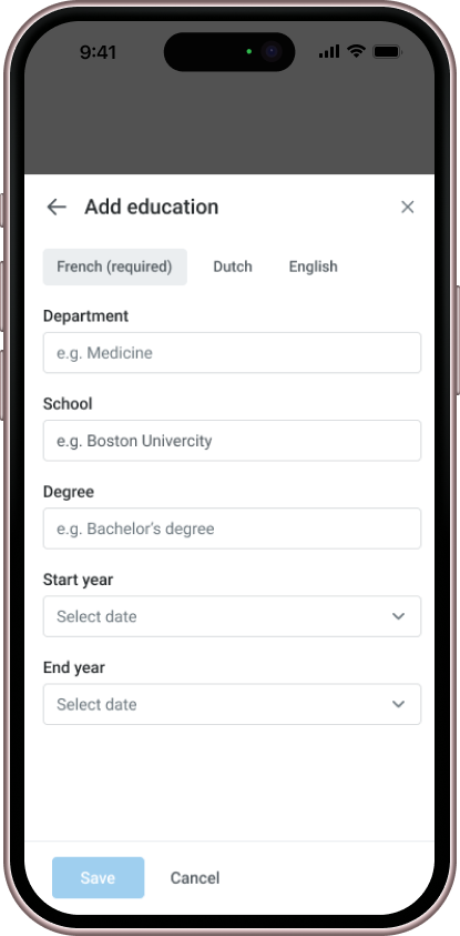
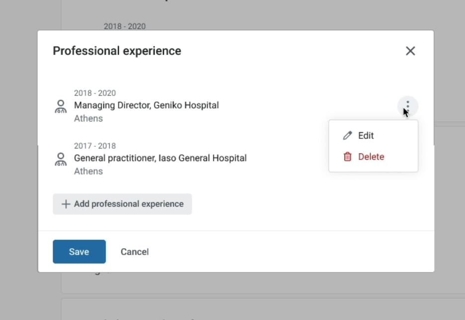
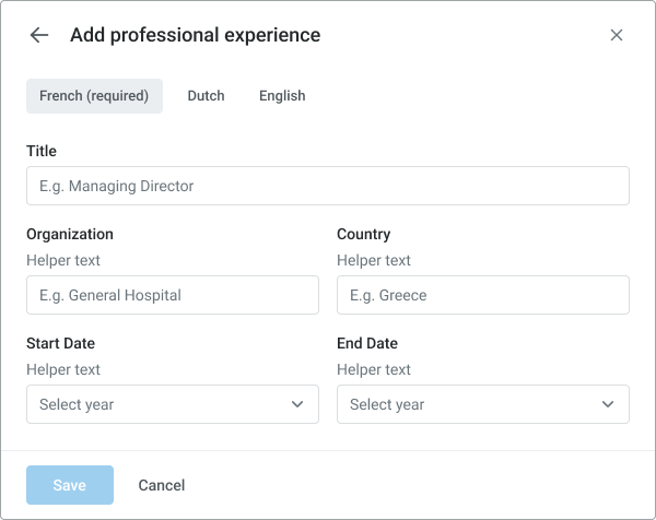
CV
We also created dedicated sections that align with the structure of a doctor’s CV, ensuring all doctors provide consistent information, such as degrees, university names, and graduation dates. To achieve this, we implemented structured data fields for more accurate and standardized input, replacing the previous free-text format, which often resulted in incomplete or incorrect information.
Feedback
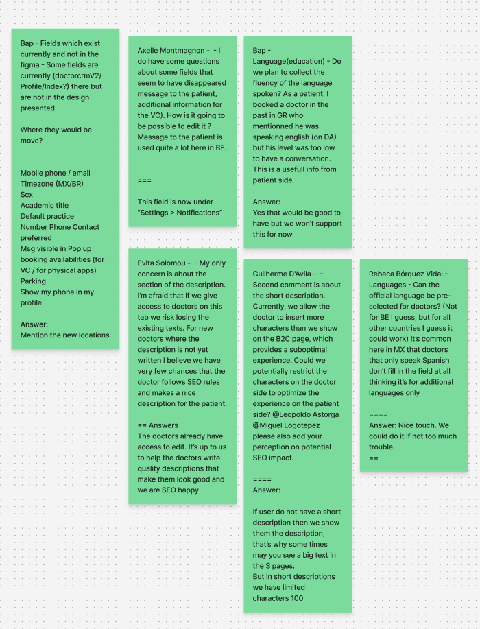
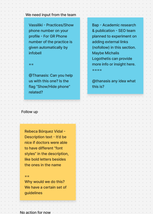
Once the concept was developed, we gathered feedback from customer support—who were our sole users at the time—along with the managers from each country.
We shared the presentation through a Loom video and created a prototype of the flow for them to review. To facilitate feedback, we provided a Google Sheet where they could easily share their insights and suggestions.
Research
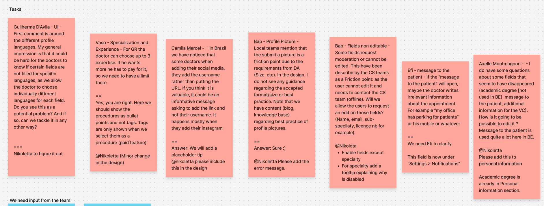
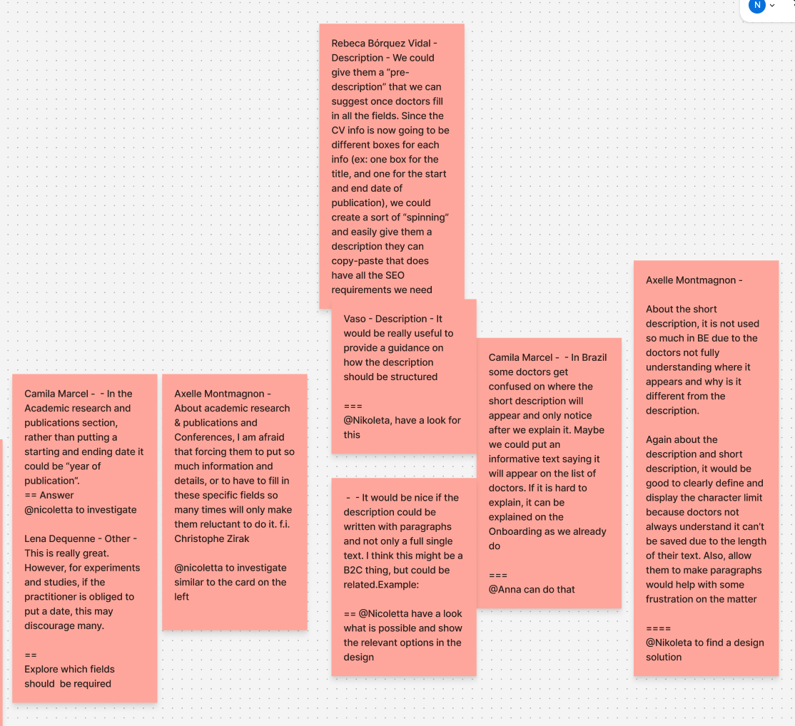
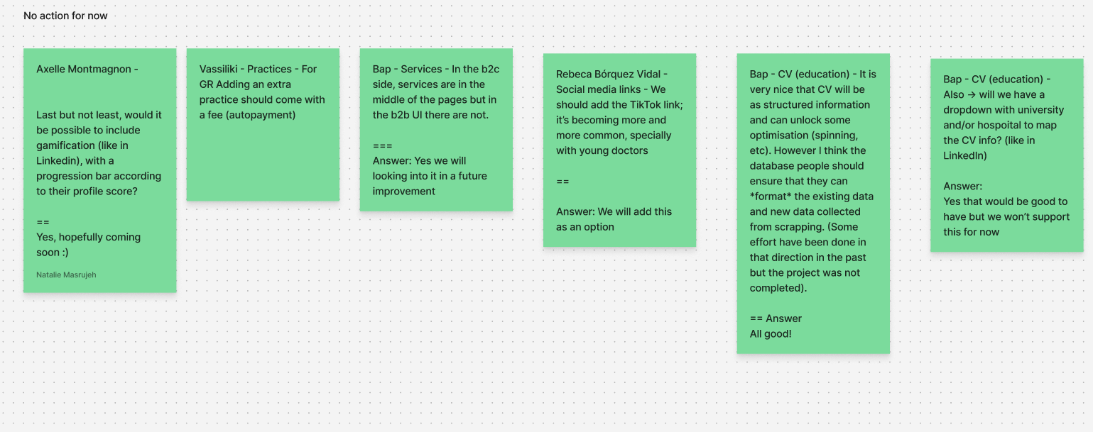
After feedback
we organized the comments into specific categories. Tasks that needed to be completed for the first release were marked with red notes. Items requiring additional technical information were tagged with blue notes. Follow-up actions were highlighted with yellow notes, and suggestions slated for the next release were categorized separately. This systematic approach allowed us to prioritize and address the feedback effectively.
Next steps
- Some design improvements
- Some information that was not included
- The add placeholder tips.
- To disable some inputs that the doctor can't change only the admins
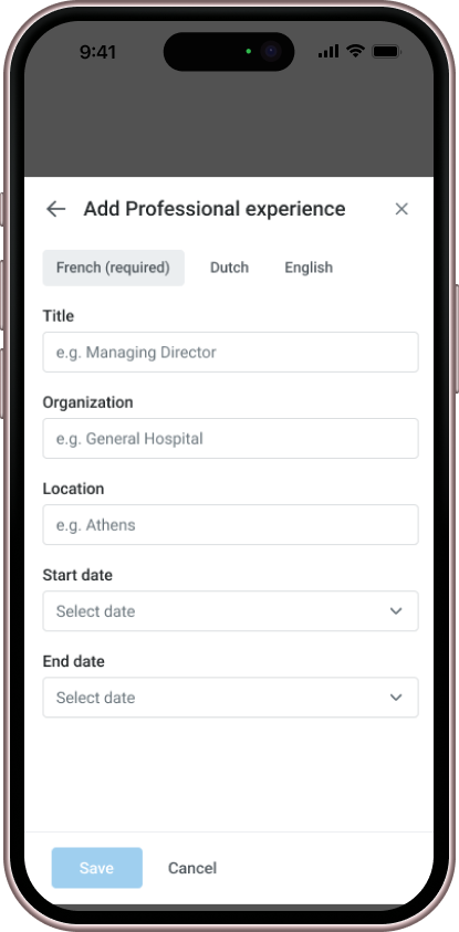
However, the biggest challenge was that the B2C site in Belgium operated in three languages, meaning the CV information needed to be completed in multiple languages.
We had to develop a solution that allowed doctors to input their details in all required languages, ensuring consistency across the platform.
Design system & UI solution
Languages
After extensive discussions with the team to address the challenge of handling the doctor's CV across multiple languages, we decided to conduct a 'Crazy 8' exercise to brainstorm potential solutions.
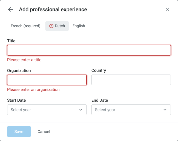
As a quick and practical approach, we opted to create separate tabs for each language, making it mandatory for doctors to complete all language versions before proceeding further. This ensured a streamlined process while meeting the multilingual requirements.
New design pattern
This pattern was introduced that had not previously existed in the product. For example, we implemented an editable section where users could click directly on the content to modify it. This interaction model, introduced in the redesign, was later adopted in other areas of the platform due to its intuitive and user-friendly nature
Modal creation
For the modal component, we’re using the Slot method.
Modal consists of three parts:
- Header
- Back button: True / False
- Close Icon: True / False
- Container with Slot Component
We use the slot component to place a local component with the following naming convention:
Modal Content / {FlowName} $descriptive name
- Actionable Footer: True / False
- Secondary button: True / False
Thanks, Rachel Zelilova for help me with this component

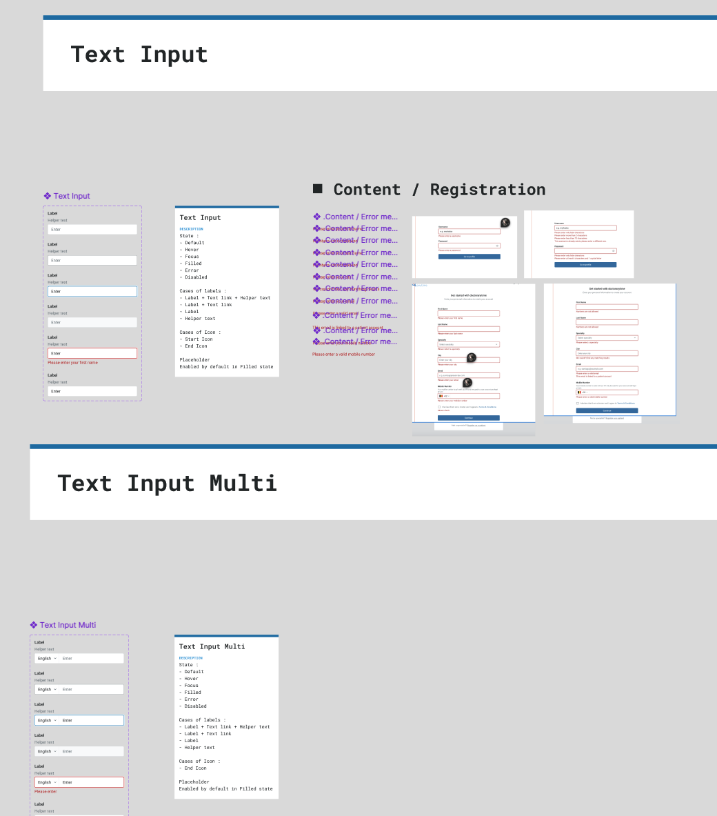
Form fields
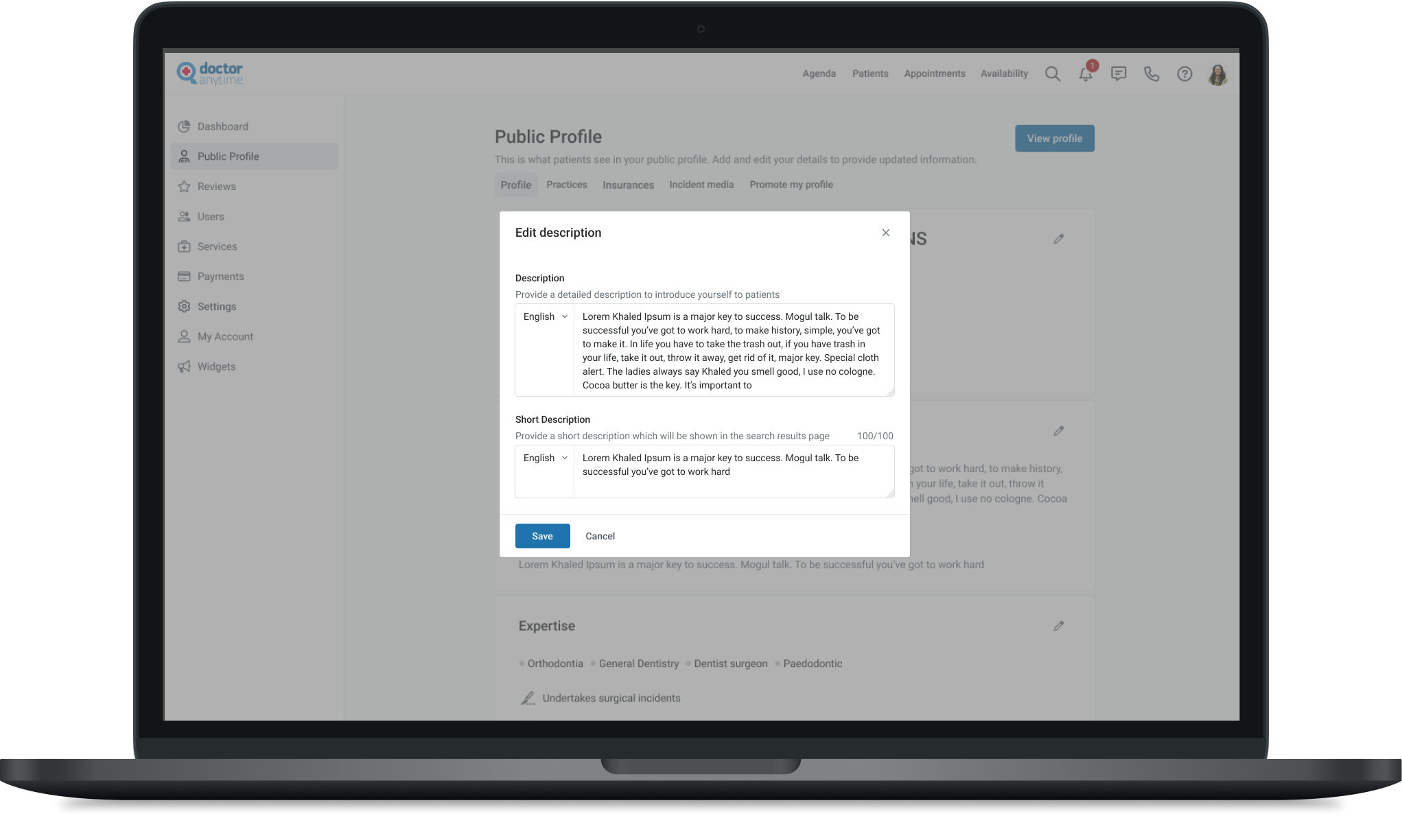
We designed the input fields with various states, including default, error, hover, and active, along with embedded icons, labels, helper text, and placeholders to enhance usability.
Content design system
We began developing a content design system, recognizing, with the help of a UX writer, that many texts were repetitive across the platform. This system allows us to standardize content, enabling users to select the ideal text for each scenario within the component, ensuring consistency and clarity
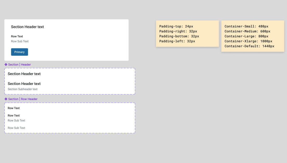
Sections
In the sections, we focused on making them visually stand out from the background while ensuring consistent spacing throughout. This approach created a clear hierarchy, improving readability and maintaining a cohesive design across the platform.
You can find more the components here